How I Built My Perfect Score Portfolio Website
This article covers how to implement multiple color themes, non-JS dependent content and get a perfect lighthouse score on a website
I'm a self-taught Front End Developer and school-taught Systems Engineer from Lagos, Nigeria.
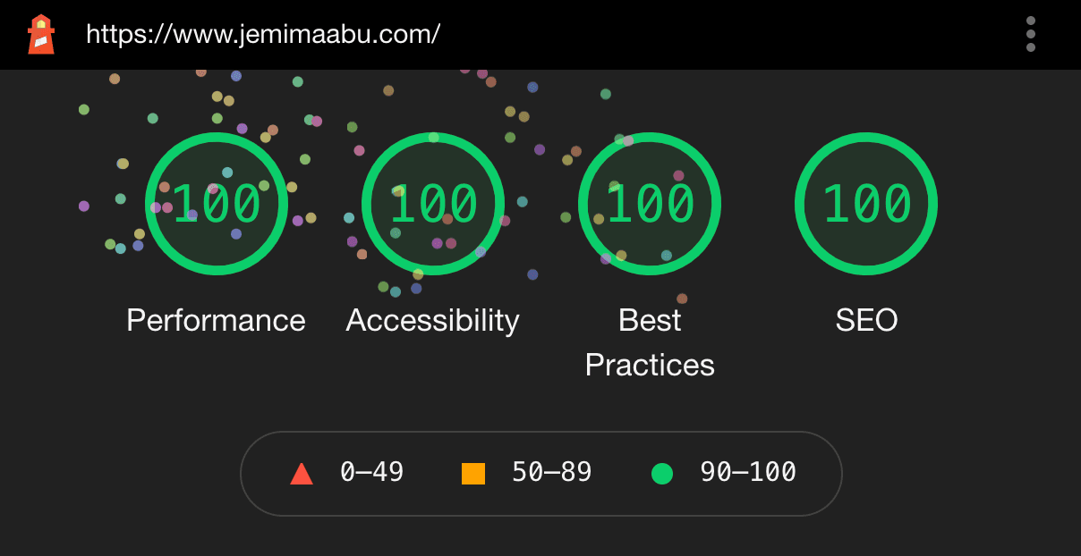
I recently published the fourth version of my portfolio jemimaabu.com. With this version, I tried to make the code as performant and accessible as possible but still have an interactive site, so this article will be about how I managed to achieve that.

These are the following features in my portfolio that we'll be discussing:
- Clear content and easy to navigate.
- Built with HTML, CSS and JavaScript (no frameworks or libraries)
- Works on JS-disabled browsers
- Vanilla JavaScript implementation of smart navigation and animate on scroll
- 6 different color themes
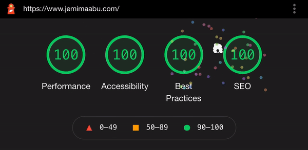
- Perfect scores on accessibility, performance, best practices and SEO
I shared the portfolio on Twitter once I was done and it got a lot of feedback and I also got messages from people asking about certain features so I decided to write this article to explain these features.
1. Creating The Design
It took me about a month to come up with the design for my portfolio, mostly because I designed the entire thing on a trial and error basis - swapping out different layouts and colors till I liked how it looked.
I also went around the internet looking at other people's portfolios for inspiration and using features that I liked.
These are some of the portfolios that I really liked and why:
- Usecue - perfect lighthouse score, call to action buttons for next and previous item
- RFarn - large text loading screen, slightly fixed header on scroll to offset the URL bar resizing
- Webinsane - brown color theme, the font 'Inter'
- Håvard Brynjulfsen - vaporwave theme
Clear content
A major reason I wanted to revamp my portfolio from the previous version was to have all my content on my site without overloading the landing page.
I had different pages for each content and chose designs I felt would best present the information:
- About page - splitting sections into expandable details to reduce text appearance on page
- Articles page - simple article title and description display according to how most blog posts are displayed
- Talks page - information set in responsive table (the table converts to a list on smaller screens)
- Projects page - projects set in slider carousel so I could include as many projects without having a terribly long page.
I also included selected parts of each content on the landing page along with a call-to-action button leading to each page to encourage user navigation.
2. Writing the code
Ever since the second version of my portfolio, which was easily the least performant version of all versions, I've always built my portfolios from scratch with HTML and CSS, using as little JavaScript dependency as possible.
I also try to avoid using frameworks or libraries so I can optimize my code for performance and accessibility.
Works on non-JS browsers
A lot of interactions on the page are actually done with CSS or semantic HTML and not JavaScript, such as:
- filter on Articles and Presskit pages - How to Build a Filtering Component in Pure CSS
- slider carousel on Projects page - CSS-Only Carousel
- expandable content on About page using HTML details - The Details disclosure element
The benefit of this is that the site isn't dependent on JavaScript for displaying information so it still works without it.
Vanilla JS Implementation
I used JavaScript to handle minor interactions on the page such as elements fading in on scroll, the smart navigation and handling multiple color themes. I also wrote two articles on how I did this:
- How to Animate on Scroll With Vanilla JavaScript on Envato Tuts+ and,
- Creating a Smart Navbar With Vanilla JavaScript on CSS-Tricks
In order to ensure that the content wasn't dependent on being displayed with JavaScript, I only implemented the effects on the elements once the JavaScript had loaded. For example, for the scroll-in element, my JavaScript code looked like this:
scrollElements.forEach((el) => {
  el.classList.add('js-opacity');
})
Then I handled styling by targeting only the classes with the js-opacity attached.
.scroll-in.js-opacity {
  opacity: 0;
}
This way the elements are only hidden if the script has actually loaded and since the landing page wasn't too heavy or making multiple calls, the script loads almost immediately.
How to implement multiple color themes
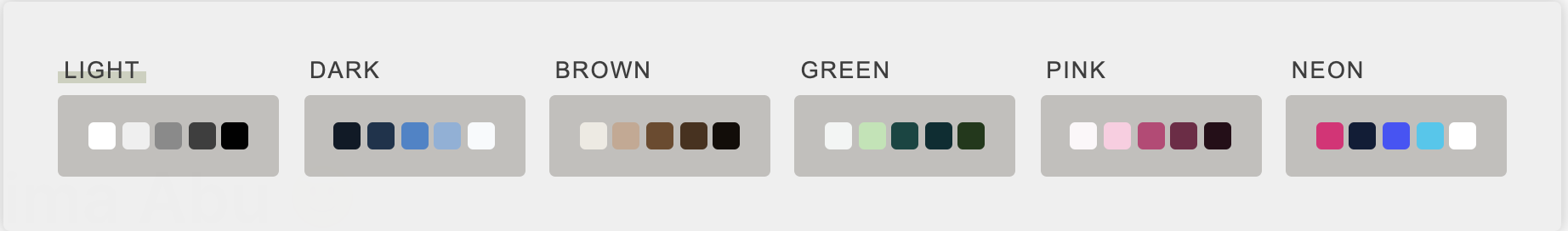 This was definitely the most fun feature to implement.
The first version of my portfolio has a dark/light theme switch but I wanted something more interesting this time so I thought, why have two colors when you can have six.
I implemented the multiple color theme feature using vanilla JavaScript and CSS. The best part is, thanks to the implementation, I could have gone on to have as many color themes as I wanted.
This is the JavaScript code for handling theme switching:
const setTheme = (className) => {
  var root = document.getElementsByTagName('html')[0];
  root.className = className;
}
All we need to do is assign a className to the root element depending on what's selected. Then the HTML looks like this:
<button onclick="setTheme('light')" aria-label="Set light theme">
</button>
<button onclick="setTheme('dark')" aria-label="Set dark theme">
</button>
<button onclick="setTheme('brown')" aria-label="Set brown theme">
</button>
...
And our CSS looks like this:
:root,
:root.light {
  --background-color: #fafafa;
  --text-color: #000;
  ...
}

:root.dark {
  --background-color: #0d1926;
  --text-color: #f7fafc;
  ...
}

:root.brown {
  --background-color: #eeeae2;
  --text-color: #120c07;
  ...
}
...
Finally, make sure you only assign colors to each element according to the CSS variable.
body {
  background-color: var(--background-color);
  color: var(--text-color);
}
An optional feature you can implement is setting a dark/light theme according to the user's system settings. We can do this using the prefers-color-scheme media query. We just need to update our default root variables:
@media (prefers-color-scheme: dark) {
/* set new default root to same colors in root.dark */
  :root {
    --background-color: #0d1926;
    --text-color: #f7fafc;
  }
}
That's pretty much the gist of the logic. You can see the complete implementation at my portfolio repository.
3. Deploying the site
Once I had all my content and logic implemented, I added the repository to my Netlify site and connected it to my custom site. You can read about how I set up continuous deployment from Netlify (and more options for hosting and deploying your site) in the third article building my portfolio inspired: How to Create a Portfolio Website – A Beginner Developer's Guide
How To Get A Perfect Lighthouse Score on Your Website
You can test the scores of your website using the Lighthouse audit tool in DevTools.
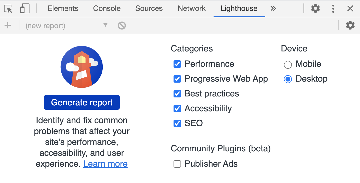
It's a good idea to run Lighthouse in incognito mode to prevent extensions interfering with your score. It returns a report giving you a score according to how well you meet certain metrics and also tells you things you can fix.
You can easily increase your score by taking note of the returned items and making those fixes accordingly.
Here's how I ensured high scores in each category:
Accessibility
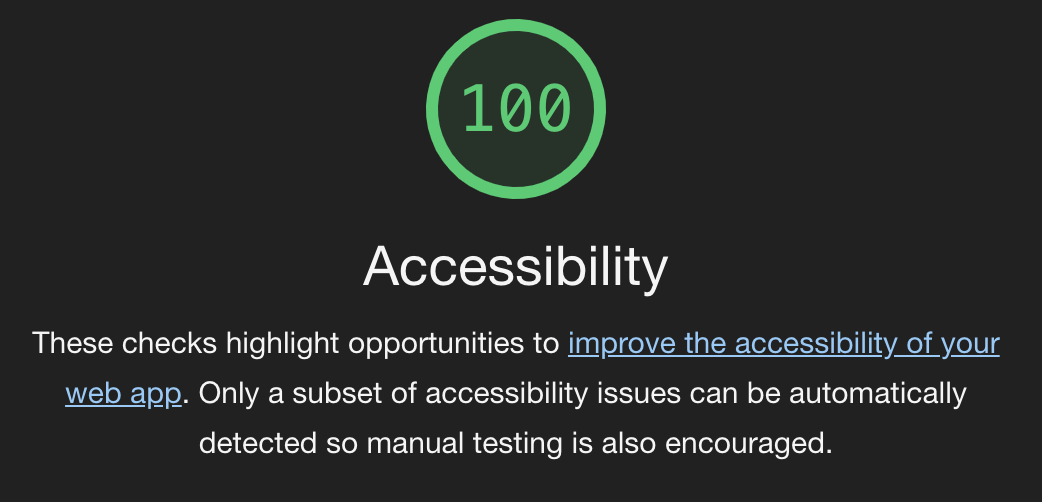 It's always best to ensure your site is as accessible as possible and not just for score-related reasons. You can watch my video on Understanding Accessibility As A Concept for more information on that.
These are some of the things I do to ensure accessibility on my site:
- Using an accessibility checklist
- Writing code with the Web Accessibility extension in VSCode
- Using the appropriate aria-roles for custom elements
- Manually testing the site after building (tabbing through and checking that all elements get visible focus, mouse operable elements work with keyboards etc).
You can also use the WAVE tool for further testing after building.
Perfomance
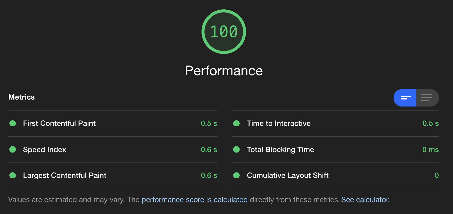 This definitely gave me the most headache but here's how I got a perfect performance score:
- Compressed all images and included an explicit width and height. This is one of the most common contributing factors to decreased performance scores mostly cause it's a lot of stress to implement. I resized all my images to be the maximum width they'd be rendered on the page, around 720px and set explicit width and height and made them responsive with CSS.
<img src="" width="720" height="340" alt="">
img {
  width: 100%;
  height: auto;
}
I was able to do this because I served static images saved on my local folder so if you're calling your images from a CDN or somewhere else, look into the options they offer for rendering responsive images.
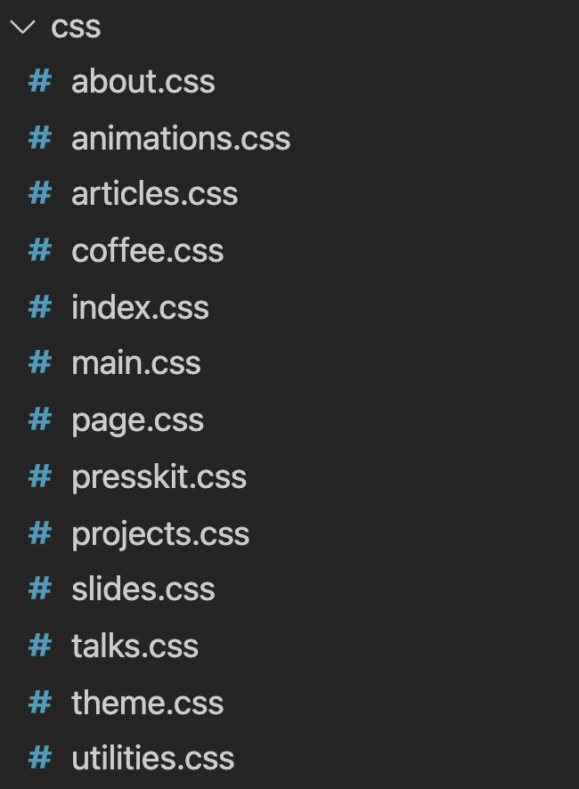
- I split all my code according to the pages calling them to make sure I wouldn't be loading unnecessary stylesheets or scripts. My site was very CSS heavy so instead of calling one large CSS file, I split the files according to the pages that needed them.
Reduced page load animation. Chrome detects how long it takes for text to appear on your page and the timing can affect your performance score so try to keep your loading animation under 1s (one second).
imported font using font-face instead of link. For some reason, Google Chrome marks downloading fonts from Google fonts as a render-blocking resource which is odd to me cause like aren't y'all part of the same company? You fix it, what do you want me to do (I'm kidding lol. Mostly).
SEO and Best Practices
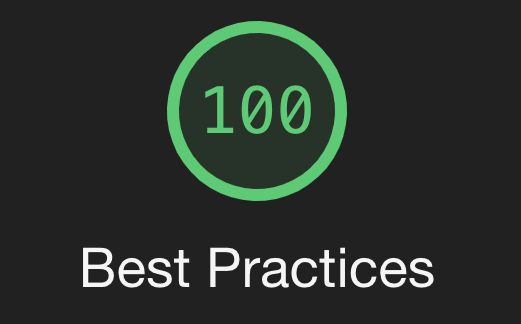
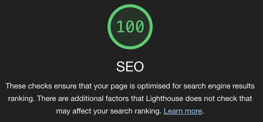
SEO and Best Practices usually go hand in hand with performance and accessibility so as long as you have good scores there, they'll follow right along. The audit report tells you what needs to be updated so you can always fix any errors that pop up.
Conclusion
And that's how I build my perfect score portfolio website. Maybe you're wondering why does it matter to have a perfect score on your website?
For bragging rights, obvy. Also, you get fireworks if you have a perfect score so that's always nice.
Seriously though, it's not the perfect score that matters, it's just the idea behind it.
You should always be building your sites to be as accessible and performant as possible, according to best practices and the SEO is an added benefit. Lighthouse scores are just a way of measuring how well you've done that.
Thanks for reading :) If you found this article helpful, let me know in the comments or on Twitter.